The Biohazard Warning Symbol
In pursuit of something memorable and meaningless.

In pursuit of something memorable and meaningless.
Following World War II, scientific research saw a dramatic expansion into the field of human health, and with it, a great increase in the occurrence of biologically hazardous situations. Biological hazards include a wide range of items, such as toxins, microorganisms, bacteria, viruses, and various forms of waste. Generally, a biohazard is any infectious agent that poses a risk to the wellbeing of living organisms, particularly human beings and their environment. Almost without exception, these hazards are impossible to detect without special procedures and equipment. If a threat was present, it had to be effectively communicated, and this proved to be the greatest challenge.
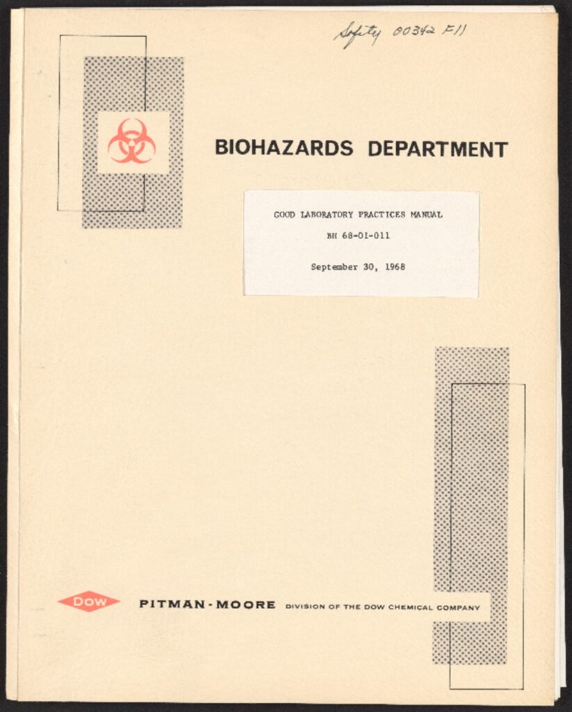
At the Dow Chemical Company, the Biohazards Research and Development team was focused on developing containment systems for biohazards in a laboratory setting. This mostly included physical barriers and pressure differentials (i.e. using higher pressure outside a room containing hazardous materials than the pressure inside the room to prevent contaminants from spreading). However, the Dow team soon came to realize that without a suitable warning symbol to be used in conjunction with its containment barriers, serious laboratory accidents would likely continue. After all, the best barrier systems still relied on people to know exactly what equipment and rooms were contaminated.
The National Cancer Institute (NCI) agreed with this assessment and contracted with Dow to investigate the current state of biological risk in American laboratories. The NCI was well positioned to assist: the agency had formed a Biohazards section to address the risks of using human and animal viral materials in research to determine whether cancer had a viral origin. The work began in 1966, led by Charles Baldwin, an environmental health engineer at Dow. Baldwin and his team toured laboratories across the U.S. to better understand how biological research was conducted, what type of precautions were being implemented, and what types of accidents had occurred. The results were alarming and showed a wide range of serious laboratory accidents that were likely preventable.
During this research, the team observed many types of homemade signs that indicated potential biohazards, but nothing that was standardized. The Navy, for instance, used a pink rectangle. The Army, an inverted blue triangle. Postal conventions called for the U.S. Postal Service’s own design of a white staff and snake on a violet field. It seemed impossible for anyone to navigate the vast array of warning signs in use, and Baldwin’s team concluded that the lack of a universally recognized symbol put the entire public at risk.
Fortunately, there was already a trend towards developing standardized warning signs in laboratory settings. Baldwin’s team had certainly come across ionizing radiation warning signs while on their laboratory tours.
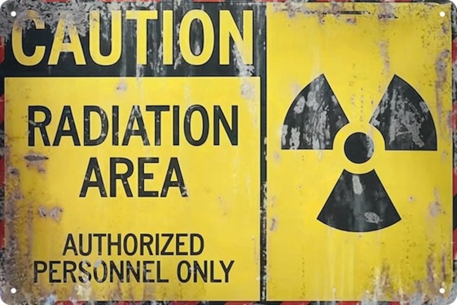
This symbol first appeared in 1946 at the UC Berkeley Radiation Lab. The design, a trefoil around a small central circle, was originally conceived to be magenta on a blue background but was changed to its current form of black on yellow after being standardized by the International Organization for Standardization (ISO) in 1963. Baldwin’s team noted that something similar was needed to protect against biological hazards and began a process to design and select a symbol for this purpose.
Baldwin did not begin the project with any particular design in mind. He simply stated that it needed to be “memorable and meaningless”—something that had no prior associations but was notable enough to be easily recalled.
Working in conjunction with Robert Runkle at the NCI and design experts from Dow’s Marketing and Package Design department, this team developed a set of six criteria for the new symbol:
Dow artists created more than 40 symbol designs, of which six were selected for final testing. They were tested across the country utilizing various survey groups convened by Dow to test product label designs.
Three hundred subjects were presented with the six symbols along with 18 other easily recognized designs, such as a dollar sign, a Chevy logo, and an ampersand.
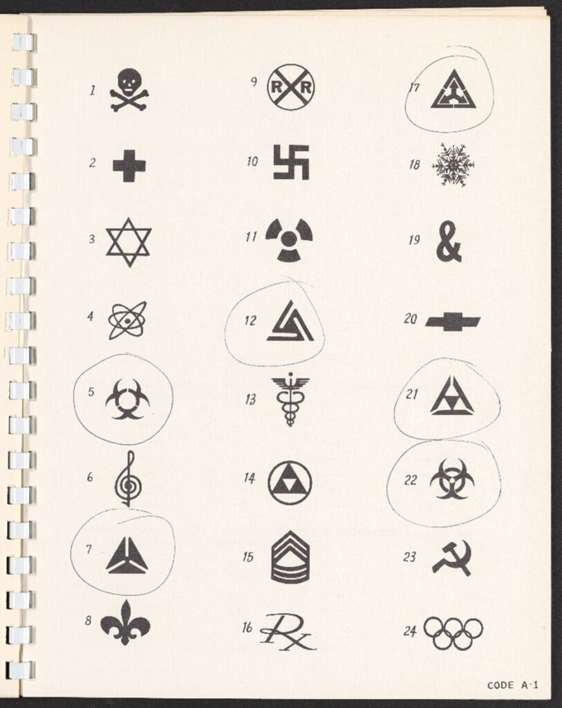
Each person in the test group was asked to guess what each symbol meant and among them all, the current biohazard symbol received the fewest guesses. It was sufficiently meaningless.
The surveyors went back to the participants one week later and showed the group 60 symbols, including the 24 seen during the first test. When asked which of the symbols they remembered from the first test, two of them achieved top scores for “memorability.”
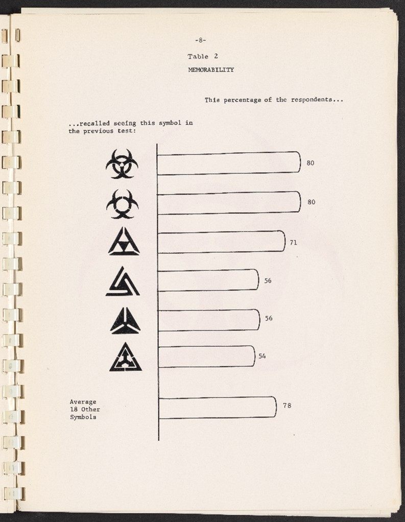
Since only one of those had also received the lowest (and therefore best) score in the “meaningfulness test,” it was selected as the symbol best suited for the job.
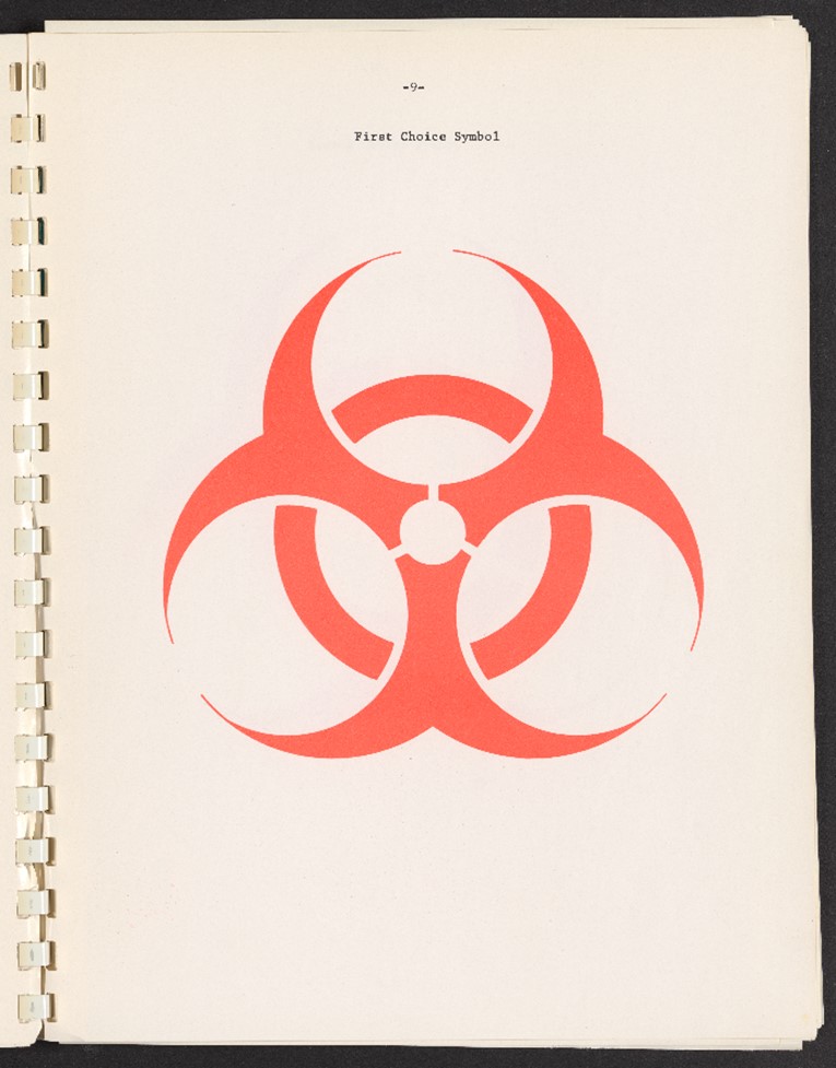
The final design was trefoil composed of three circles overlapping a fourth, similar to a Venn diagram.
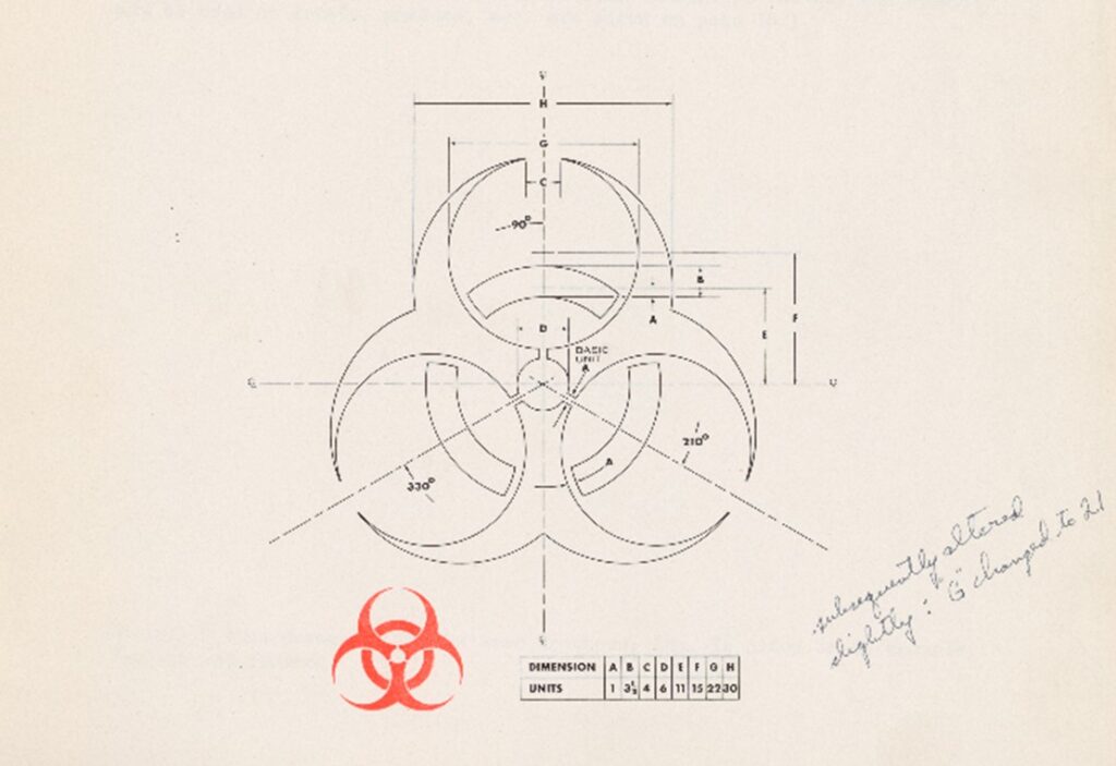
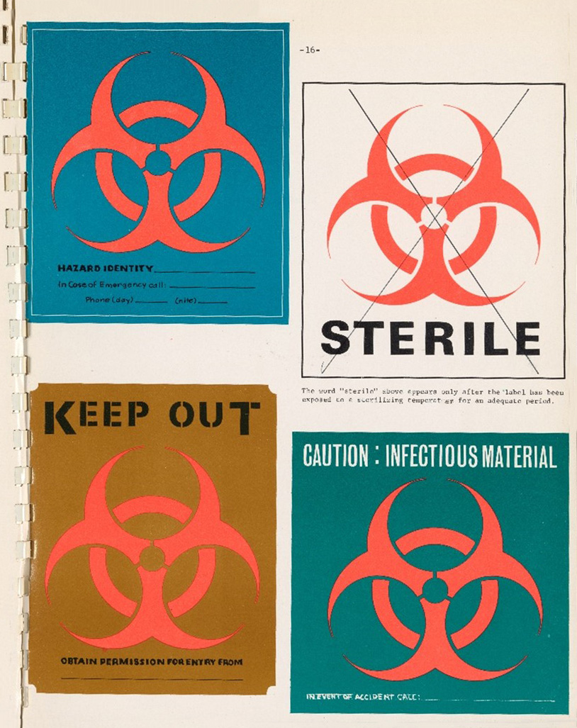
Its simplicity and symmetry made it easy to recognize and allowed it to be positioned in any orientation during shipping. Its fluorescent orange color excelled at capturing people’s attention, particularly when placed on contrasting backgrounds.
The symbol was presented by Baldwin and Kunkle to the scientific community in a 1967 article in Science. By then, it had already been evaluated and tested by the National Cancer Institute and other selected national laboratories. In short time it was adopted by the Centers for Disease Control and the Occupational Safety and Health Administration, and in 1969 it was accepted as a standard by the American National Standards Institute (ANSI). America’s trade partners soon followed suit, and global adaptation came soon after. It was declared a global standard by ISO in 1986.
In the years since, the symbol’s effect on biosafety has been great, although difficult to quantify. It has been used to protect the scientific and medical communities, workers in the fields of shipping and waste disposal, and even the general public in a variety of settings, such as hospitals and airports.
The symbol is still in widespread use, virtually unchanged, but in recent years popular culture has appropriated and transformed it for its own uses. Its striking, somewhat wicked design makes it a popular choice for use in movies, video games, and album graphics. Indeed, some young people may be aware of the symbol’s existence without actually knowing its actual meaning. Personally, I first became aware of the symbol in the context of the Brooklyn-based hardcore band, Biohazard. As a teen, I assumed that my doctor was a huge fan. “How could he not be?” I asked my mom, “their stickers are all over his office!” She quickly set me straight. Just the same, I imagine the band is a major reason why so many people rock the biohazard tattoo to this day.
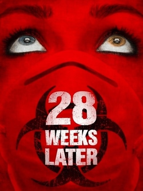
The symbol has also gained cultural significance in an array of zombie-themed media. For example, the 28 Days Later film series, the third of which will be released this summer, features the biohazard symbol prominently on all its marketing materials.


Its prolific use highlights the fact that even during an undead apocalypse, safety symbols will continue to be of immense importance.
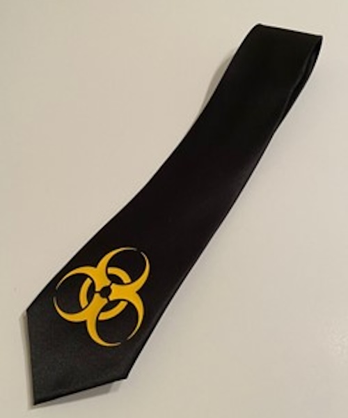
Baldwin himself was delighted that the symbol had become so ubiquitous. In a 2001 New York Times interview, he stated, “Every time I go into the doctor’s office . . . I’ve always got my eye out for it. Naturally, I’m proud of the fact that I was able to come up with something . . . that’s so widely recognized, so helpful.” However, he was not at all pleased with how it had been appropriated in popular culture and continued to say, “I ran into a peculiar situation a couple years ago when someone was putting on a seminar on biohazards. As gifts for the participants, he devised a beautiful tie with little biohazard symbols all over it. This got me upset, and I sent him kind of a nasty letter saying this symbol was not designed to be used sartorially.”
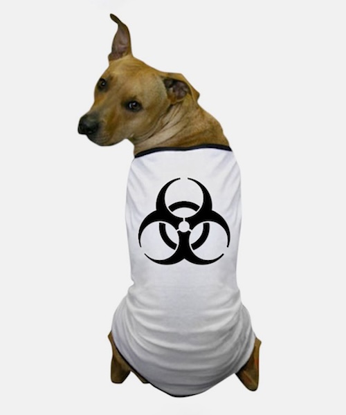
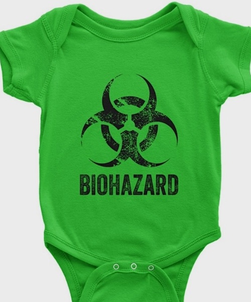
Despite Baldwin’s objections, one can get the biohazard symbol emblazoned on just about anything these days. A simple Google image search reveals dog clothing, baby onesies, iron-on patches, temporary tattoos, coffee mugs, hats, and, of course, neckties.
Has the use of the biohazard symbol in these ways diluted its true meaning? Perhaps, but I don’t think there are too many people who would willingly wander into a space posted with such a warning. Around the world, the biohazard symbol conveys danger in every language.
Featured image: Safety sign sold by ZING Green Safety Products.

Public perceptions of 20th-century medical science as seen through book cover illustrations.

The Institute’s museum education team partners with Philly Touch Tours to offer a more meaningful history of science experience.
Mapping Philadelphia’s industrial past with digital tools.
Copy the above HTML to republish this content. We have formatted the material to follow our guidelines, which include our credit requirements. Please review our full list of guidelines for more information. By republishing this content, you agree to our republication requirements.